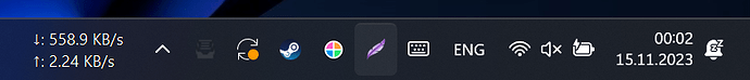
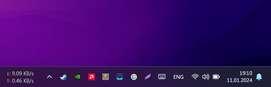
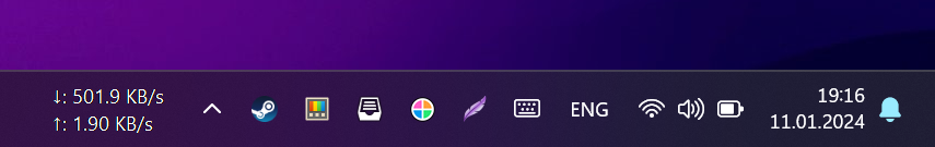
So, after last update (Rework tray icon style commit) was updated icons, removed light icons and replaced with dark icons, I don’t know why, reason of that, but now, it look horrible on windows 11 in dark mode. Icon has very bad visibility.
Same with blue one (when I receive new emails), looks not too good.
Thanks for the report. I have never seen the dark mode on Windows.
I will try to come up with a solution. Let’s hope, that I can get information about the dark mode for this from within electron. This is probably possible by checking nativeTheme | Electron
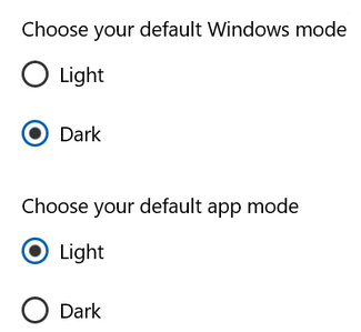
I have been following this thread as I had the same problem and I have seen that this bug may not be fully fixed. It works when Windows application mode is configured as dark, but what we want to check here is the Windows System mode, which is the one that affects to the tray icon. For example, with this configuration we have a dark system tray but a light application mode, so Mailspring detects the application theme as light and uses a dark icon for the system tray:
I don’t see any option how we can tie the behavior to anything other than that. If you have any suggestions on how to do this, I will have another look.
An alternative I have seen in other apps is the ability to manually change the tray icon color in the Settings/Preferences (auto [default, current behavior], dark, light). I know that this might not have a very high priority, but do you think it could be done this way? There is already a tray icon configuration section in preferences’ Appearence tab where it could be placed.
For example, look at others icons, how clear they are, and Mailspring icon, it’s like 16x16 upscaled to 34x34
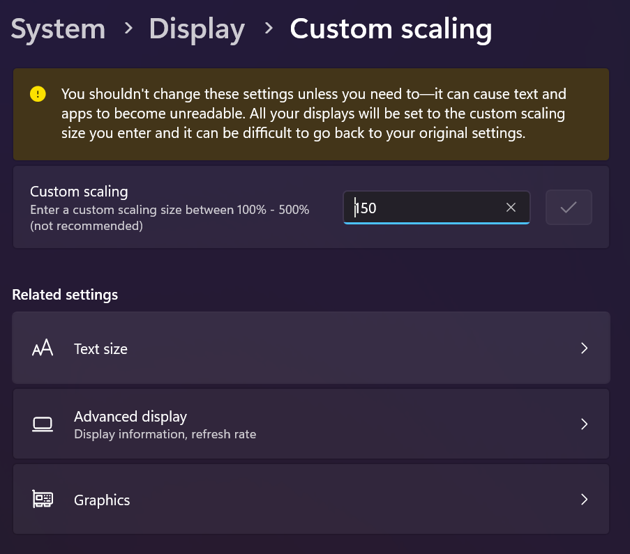
I have 2K display (2560x1440) on laptop with 150% windows scale (nothing special), I think even on my work laptop with 1920x1080 screen with scale of 125% will be same worst quality.


