When I take a quick glance at mailspring, its not easy to see which messages are unread. The little blue dot is just too small and insignificant.
Proposed Solution
Bold letter on the entire message preview would really benefit. I realize that its already bold in some themes, but not significant enough, it needs to be bolder, or add a darkened/lighter background than the rest of the messes.
There are many other ways to make it stand out, this is just one of them.
Context
Every other mail client uses bold letter and a background to contrast unread messages
Very good idea, I actually tried a lot of different themes looking for this, I already tried to modify a theme but was unsucessfull.
I was using for a long time mailbird on windows and just moved to linux, not happy with thunderbird outfit I am using mailspring for now. I am missing the mailbird layout and ergonomy, could be a good inspiration to make evolve mailspring.
Depending on the theme you may need to put it in a different file I think. Also you may want to change the color of the shading, and you may want to also change the hover color, etc. Let me know if you need help.
I actually like Mailsprings simplicity. I feel like Mailbird and others were just a bit too “feature-jammed” for my liking.
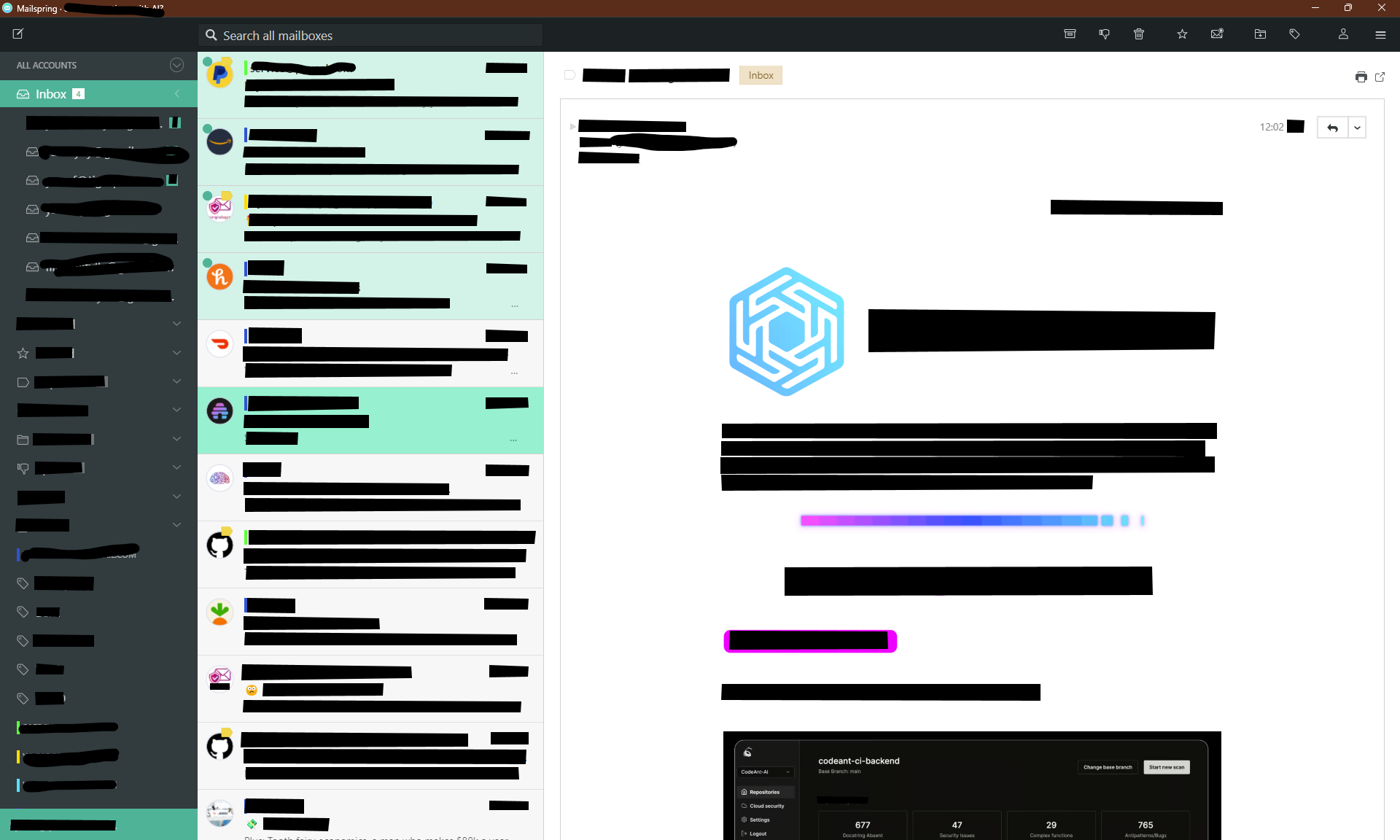
Here’s a screenshot of my edited Matcha Theme. Light green shading is unread messages, Darker green is the one currently selected. I would also love if I can move the unread circle indicator from the left side, where it is a bit cluttered and lost, to the right side where it can be more prominent but not sure if thats possible yet.